All posts in Logo Design
- 06/11/12
- Comments: 0
Website Design – Harmony Tree Learning Center


The old website design

Harmony Tree new logo
It is a pleasure to write about the redesign of Harmony Tree Learning Center’s logo and website. The center offers tutoring programs to school age students. They were looking for some whimsical, welcoming graphics, artistic organic logo, easy navigation for the website and more professional, polished look all around.
For this project I asked my sister Iglika to join me in creating the designs. She has such a happy and cute style of illustrating children and was perfect for this job. With my art direction she created some beautiful images which I implemented in the logo and website.
The whole process was smooth and Grace (who supervised our work) gave us plenty of creative freedom. Visit the website for some eye candy and more information:
harmonytree.org
Design Garden (Sabina) has been amazing to work with. She designed our learning center’s website and was able to capture the feeling I wanted when people visited our site. She was very responsive during the process and her communication and follow ups were great! She really paid attention to what I wanted for the site & gave great advice to what would work and what might not. Her designs are creative and unique, truly unlike any other I’ve seen out there while I was in the process of choosing a website designer. I am so happy with this experience that I am already in the process of hiring her for another job! I highly recommend her to anyone out there looking for a talented graphic design artist!
Grace Han
- 06/11/12
- Comments: 0
- Tags: harmony tree, logo design, website design
- 15/06/12
- Comments: 3
Latest Design Projects
-

- 5

-

- 4

-

- 3

-

- 2
-

- 1

I had some fun projects lately.
1. Aura Dog is a website and Etsy shop that sells crystal charms for animals. This is really a new territory for me. I learned about singing bowls, homeopathic crystals and Chakra symbols. At some point I drew all Chakra symbols with the wrong colors because I had no idea that there are specific colors for each one. It was a challenge to depict the energy that comes from the crystals and all objects in the banner. I used some watercolor brushes for this purpose. Also I made portraits of the 3 cute pets of Christina (the shop owner).
2. A logo design for Resort Jewelry Stores. I had fun drawing small houses inspired from pictures in Aspen and other resorts. I think we arrived at a logo which is both elegant and has a relaxed, fun feeling to it.
3. Redesign of the Photo Card Boutique logo. I liked their previous logo as well. They are now changing direction in their business, adding new products and they needed something different. The one thing that we kept from the previous logo is the star. I think the new logo fits very well with their products as one can see on their Facebook page where the new branding is implemented.
4. The final version of the banner for the Three Sweet Ps blog. I wrote before about the design process of this banner. The client has a wonderful blog where she writes about her family of 3.
5. Logo design for Pucker Up Pretty. This is a business that provides photo scenes for weddings. I learned about the existence of the Louis Ghost chair. Honestly, I didn’t know that plastic chairs can look that fancy.
- 10/05/12
- Comments: 1
Logo and Website Design – Cake Nutrition

![]()


Vanessa is a nutrition consultant based in UK. I designed her logo and website recently and I am pleased to write about the project here. When I think of good nutrition I imagine apples and carrots. Cakes are somewhere in the list of forbidden food. This is why Cake Nutrition is such a curious name for a nutrition consultancy business.
Vanessa was certain that she does not want a logo with carrots and apples. She likes turquoise, light blue, white, red and pink colors. She prefers retro style to modern. Also she is a perfectionist, something I discovered in the process of work. I understood that her brand is about good, delicious food and about information presented in a fun creative way, not about the dry facts. With this in mind we worked together through several concepts till we found the right design for her. I became again convinced that generally clients knows best what design will work for them. We designers should not push our ideas at all cost but should truly listen to what the client is saying.
Visit the Cake Nutrition website!
I stumbled across Sabina whilst researching potential designers for my branding and website design, and I’m so glad I did. With her patience and creative flair, I think that she’s produced some brilliant work. I think that the final design is just perfect and so many people have complimented me on it. I’m hoping to work with Sabina again on future projects and would have no hesitation in recommending her services!
Vanessa Hattersley | Cake Nutrition Co.
- 10/05/12
- Comments: 1
- Tags: branding, cake nutrition, logo design, website design
- 21/02/12
- Comments: 2
Missala Handmade Branding Set

 I am really happy to see these designs in print! I most often only get to see the digital version of my designs. The real beauty I think is in the print – the paper texture, the inks, the tangible design.
Misala Handmade are one of my favorite clients – a really sweet couple, they are always friendly, encouraging and their fun products are so inspiring. Some time ago I created an Etsy set for their shop and a month ago a branding set including logo, business cards, tags, fabric labels and some cute Busy Beaver Button Co. Buttons to be given away as gifts.
Sabina was absolutely brilliant as she provided very valuable idea and direction upon seeing my Etsy store for the first time and come up with an absolutely fantastic design for my brand. The branding items had become the cornerstone of my little business to build and expand upon. A professional in the field with an unique hand-drawn illustrated style, she is recommended for anyone looking for something other than the boilerplate designs that floods the marketplace.
Michelle | Misala Handmade
- 21/02/12
- Comments: 2
- Tags: branding set, Busy Beaver Buttons, identity, logo design
- 08/02/12
- Comments: 0
Latest Design Projects
-

- 1

-

- 2
-

- 3

-

- 4

-

- 5

-

- 6

1. This branding set I designed for a pair of photographers – Adorn Photography. The girls insisted on having snowflakes as the central theme of their branding. Initially I thought that this may turn out too seasonal. After getting to know them, I think, in an abstract way, the branding fits with their unique style.
2. Logo design for Misala Handmade. The client was so excited by the Etsy set that I made before, that they ordered a branding set. I love when clients return to me and it makes me feel appreciated as a designer.
3. and 4. I designed two blogs in the last month and both are about cooking. It is interesting how two designs on the same topic can differ so much. The first is The Red Recipe Book for a client who wanted to surprise her mother and give her this blog as a gift (the modern way of making gifts to parents). The second blog I designed for Jennita Russo, an amazing woman who is a dancer, choreographer, private chef, florist and event/wedding planner.
Once again I wanted to thank you for amazing job you did on my website. You are a such a talented artist/designer and made the whole creative process a delight. I greatly appreciated your attention to detail, the quickness of completion, and your expertise and guidance through the whole process!
Jennita Russo | Sugar Plum Foodie
5. A website banner for Amanda Hervey – a freelance writer, editor & stylist. Amanda is the author of “Kentucky A to Z”. The theme of the banner is “Exploring backroads” and I was inspired by pictures of horses and scenery from Kentucky.
6. Blog banner for Mareike Murray – a wedding photographer based in Glasgow, Scotland. The theme of the banner is “Scottish Highland Vintage Romance”. Mareike likes scenery filled with light and also lochs and flowers.
- 08/02/12
- Comments: 0
- Tags: blog banner design, blog design, branding, identity, logo design
- 24/11/11
- Comments: 2
Latest Projects
-

- 1

-

- 2

-

- 3
-

- 4
-

- 5

1. Banner design for Avelaine Scyrup – wedding photographer, part of a branding project. The theme for the banner is “Glamour girl in the big city”. The city scape behind is Calgary in Canada. There are some nice personal details like the the car, which she drives (under the logo) and a number on the shop door (on the right side) which is the same as of a lottery ticket that her grandfather won once. Does this mean anything to her clients? No, but it does tell a story and has an intimate feeling, something that I am usually after in design.
2. Etsy set for Misala Handmade. The client makes fun little bags and purses. The style they wanted to capture is a mixture of shabby chic, polka dots, kawaii style. Many of the hand drawn elements in the banner are inspired by their products.
3. Logo design for Minikin Jewelry, part of a branding set. The client wants her designs to appeal to both her Japanese customers and also US customers. I like the freshness of the color scheme which she chose.
4. Logo design for Sew – modern fabric studio, part of a branding set.
5. Banner for Smitten by Carmen Weddings. The client is a wedding planner and the theme for this banner is ‘Love makes the world go round’. All elements are drawn by hand with ink and then digitally colored. I think the theme is clever and appeals to the adventurous, dreamy side of brides.
- 24/11/11
- Comments: 2
- Tags: banner design, branding, latest projects, logo design
- 01/10/11
- Comments: 3
Latest Projects
-

- 1
-

- 2


It was a very busy week. It seems the season of hard work begins now, after the summer vacation.
1. Logo design for a desserts bakery in Canada. The whisk is hand drawn, matched with a pretty font called Dolce Caffe by one of my favorite type designers Giuseppe Salerno.
2. Branding design for a bakery in US (this week was much drooling over pictures of cakes and sweets). Almost all elements of the branding are drawn by hand with ink on paper and then digitally processed. It is my favorite way to work these days. Joanna asked for an English country kitchen style.
3. Banner design for a personal wedding website. The client asked for a beach theme and a mixture of abstract with vintage romantic elements. The swirls represent the sea in an abstract way while the hand drawn ribbon gave this classic feel. The vines added to the romantic elegance.
4. This was a very fun banner to design as a part of a branding package for Eliza Claire, UK wedding photographer. The client wanted to have the “English Country Village Fete” theme through this banner. For the first time in my life I hear that hay bales can be used as tables or seats on a wedding party. It was fun to draw these.
- 01/10/11
- Comments: 3
- Tags: banner design, branding, logo design, romantic
- 13/09/11
- Comments: 0
Latest Projects
-

- 1

-

- 2
-

- 3
-

- 4


Here is what I have been up to in the last weeks.
1. A snapshot of a new website project. I will post more about it soon.
2. Logo design for a cupcake business in The Netherlands. The tree with cupcakes is hand drawn and it was much fun to work on it.
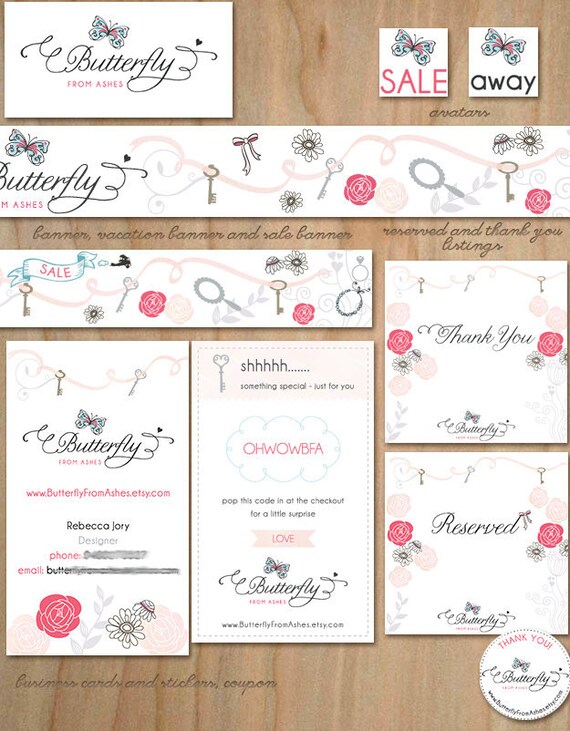
3. Logo for Butterfly from Ashes. Again the butterfly is hand drawn and I just love the color scheme of blue, black and red-pink. The whole Etsy branding set turned out beautiful.
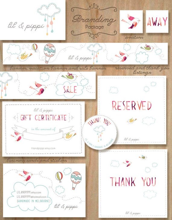
4. Logo design for lil & pippi. The client makes awesome fabric cloud mobiles. This was also part of a branding set.
5. A banner design for UK customer Kari Bellamy. I like how we mixed urban with romantic elements.
- 13/09/11
- Comments: 0
- Tags: banner design, logo design, website design
- 11/06/11
- Comments: 0
Latest Projects
Some bits and pieces from my latest projects.
1.
2

3

4
2. A logo design for Paper, Lace & Confetti. This name stands for a wide range of products – jewelry, paper goods, invitations, DIY Party decorating packages, Edible sweets and more! It was a challenge to create one logo to unite all this astonishing diversity.
3. New website project which I am still crafting at the moment. My client is a young, interesting woman and I am inspired to create something for her. I will post soon more details about this project.
4. A banner design for Darling Belle Events. Amanda was looking for something fun, whimsy, romantic and flowy. When she mentioned a tandem bike, I envision one where ranunculus flowers are flowing out of the basket. And all other elements came to place after that, as usually happens with my banners.
- 17/03/11
- Comments: 0
Logo design for Hide & Sleep

Jacinda, the owner of Hide & Sleep, is an interior designer of children’s rooms based in Melbourne, Australia. She likes sage, soft pink, peach and beige colors. Her preferred style is whimsical. Her customers are stylish young moms.
In this project I collaborated with my sister Iglika, who is a professional illustrator and artist. This is one of our first projects together and it was fun. We were brainstorming on a more abstract logo image in the beginning. Our client liked this proposal but it was not fitting her personal style. So we moved to a more direct approach to the hide and sleep theme – a girl sleeping behind a cloud or girl hiding behind a sleeping cloud. Jacinda loved the latter one.
-

- first proposal

-

- second proposal

-

- final logo

