All posts tagged banner design
- 06/11/12
- Comments: 0
Latest Design Projects
-

- 3

-

- 2

-

- 1

These are few of the projects on which I have been working in the last months. There is much more to show but I have been very busy lately with new projects and TheInkNest.
1. Logo and banner design for The Pancake Events. Lauren likes feminine floral and elegant designs.
2. Logo and website graphic design for Mon Petit Monde. Swiss shop with assortment of children furniture and nursery decor. The owner, Justyna is a work-at-home-mom who started a new business. It is always inspiring to work with such women and to exchange baby photos.
3. Banner design for Planeta Vino. I was craving vacation while designing this banner. I don’t want to say I was craving wine because that would sound a bit like alcoholism. But defininetly the feeling of sipping wine in Spain in a warm sunny afternoon.
- 06/11/12
- Comments: 0
- Tags: banner design, blog design, ecommerce design, website design
- 07/06/12
- Comments: 0
Work in progress – Banner Design – ThreeSweetPs

Working on a new banner for a personal blog. It is a complex banner which unites many elements meaningful to my client like – the mountains of Utah, photo camera, Lily (as her daughter’s name), Harry Potter books (her favorites to read), washable baby diapers and more. The theme is “Family of three that loves to read”.
I am often asked about my design process. It is really hard to explain what I do because it has become an intuitive process. From experience I know how to approach the theme and how to make it work. As you can see from the image above: (1) I start by creating the graphics on paper and there is really no composition to the moment when I move them in Illustrator (2). Coloring the banner is one of the last steps (3).
- 07/06/12
- Comments: 0
- Tags: banner design, design process
- 16/04/12
- Comments: 0
Blog design – A Lovely Place To Land

Recently I posted about a banner design I created for the website of Amanda Hervey – a freelance writer, editor & stylist. I also designed her personal blog – A Lovely Place To Land.
While the theme of the first banner was “Exploring backroads” and illustrated her experience of traveling through Kentucky, the theme of her personal blog is “An oasis in a busy world (my landing place)”. I really like this theme filled with childhood/motherhood symbols.
Amanda has a very personal and pretty style of writing. The blog design reflects this, setting the mood for a really wonderful place to land.
I have to admit, when I first reached out to Sabina, I was nervous that the physical distance between us would be a problem. I just couldn’t imagine how she would be able to create a look that expressed where my heart is without ever stepping foot in Kentucky, where I live and write. But once I started working with her, I quickly realized that she is one of those rare people who truly listen for the sound of your heartbeat and then works to create something so beautiful and deeply personal, you couldn’t have imagined it yourself! She created both my professional writing site and my blog and both are perfect representations of my home and heart and for that, I’m deeply grateful. People always say that business isn’t personal, which I don’t understand. You put everything you have into your work and Sabina understands that; luckily, she puts everything she has into her work as well so you can’t go wrong when you put your business in her hands.
Amanda Hervey | Amanda Hervey Creative
- 16/04/12
- Comments: 0
- Tags: Amanda Hervey, banner design, blog design
- 24/11/11
- Comments: 2
Latest Projects
-

- 1

-

- 2

-

- 3
-

- 4
-

- 5

1. Banner design for Avelaine Scyrup – wedding photographer, part of a branding project. The theme for the banner is “Glamour girl in the big city”. The city scape behind is Calgary in Canada. There are some nice personal details like the the car, which she drives (under the logo) and a number on the shop door (on the right side) which is the same as of a lottery ticket that her grandfather won once. Does this mean anything to her clients? No, but it does tell a story and has an intimate feeling, something that I am usually after in design.
2. Etsy set for Misala Handmade. The client makes fun little bags and purses. The style they wanted to capture is a mixture of shabby chic, polka dots, kawaii style. Many of the hand drawn elements in the banner are inspired by their products.
3. Logo design for Minikin Jewelry, part of a branding set. The client wants her designs to appeal to both her Japanese customers and also US customers. I like the freshness of the color scheme which she chose.
4. Logo design for Sew – modern fabric studio, part of a branding set.
5. Banner for Smitten by Carmen Weddings. The client is a wedding planner and the theme for this banner is ‘Love makes the world go round’. All elements are drawn by hand with ink and then digitally colored. I think the theme is clever and appeals to the adventurous, dreamy side of brides.
- 24/11/11
- Comments: 2
- Tags: banner design, branding, latest projects, logo design
- 03/11/11
- Comments: 2
Work in progress

I am working on yet another website banner. The theme is “Oriental Garden”. My client is a creative young woman with a Japanese origin. This is just a work in progress and the final banner may look quite different.
Sometimes people ask about my creative process. This is basically how it goes:
– we brainstorm with the client on a theme for the banner. A theme is something that unites all elements in a design. The elements can be very different but the theme keeps them together and helps to elevate the design to something more than just a soup of graphics.
– I make the drawings on paper with pencil, then I trace them with an ink pen.
– the images are scanned and transferred to illustrator. In illustrator I color all images and arrange the composition.
– finally the banner image goes to Photoshop where I may add some elements with brushes or experiment with background colors and textures.
- 03/11/11
- Comments: 2
- Tags: banner design, creative process, oriental garden
- 01/10/11
- Comments: 3
Latest Projects
-

- 1
-

- 2


It was a very busy week. It seems the season of hard work begins now, after the summer vacation.
1. Logo design for a desserts bakery in Canada. The whisk is hand drawn, matched with a pretty font called Dolce Caffe by one of my favorite type designers Giuseppe Salerno.
2. Branding design for a bakery in US (this week was much drooling over pictures of cakes and sweets). Almost all elements of the branding are drawn by hand with ink on paper and then digitally processed. It is my favorite way to work these days. Joanna asked for an English country kitchen style.
3. Banner design for a personal wedding website. The client asked for a beach theme and a mixture of abstract with vintage romantic elements. The swirls represent the sea in an abstract way while the hand drawn ribbon gave this classic feel. The vines added to the romantic elegance.
4. This was a very fun banner to design as a part of a branding package for Eliza Claire, UK wedding photographer. The client wanted to have the “English Country Village Fete” theme through this banner. For the first time in my life I hear that hay bales can be used as tables or seats on a wedding party. It was fun to draw these.
- 01/10/11
- Comments: 3
- Tags: banner design, branding, logo design, romantic
- 13/09/11
- Comments: 0
Latest Projects
-

- 1

-

- 2
-

- 3
-

- 4


Here is what I have been up to in the last weeks.
1. A snapshot of a new website project. I will post more about it soon.
2. Logo design for a cupcake business in The Netherlands. The tree with cupcakes is hand drawn and it was much fun to work on it.
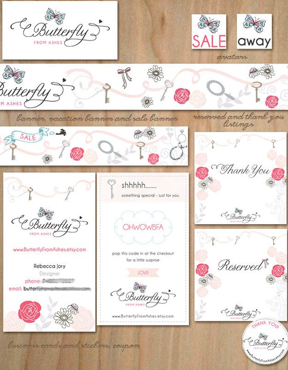
3. Logo for Butterfly from Ashes. Again the butterfly is hand drawn and I just love the color scheme of blue, black and red-pink. The whole Etsy branding set turned out beautiful.
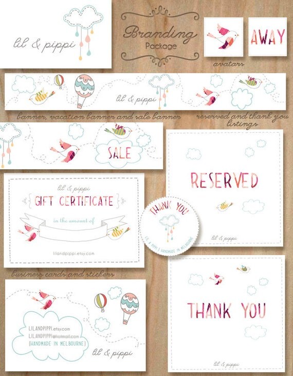
4. Logo design for lil & pippi. The client makes awesome fabric cloud mobiles. This was also part of a branding set.
5. A banner design for UK customer Kari Bellamy. I like how we mixed urban with romantic elements.
- 13/09/11
- Comments: 0
- Tags: banner design, logo design, website design

