Blog
- 01/10/11
- Comments: 3
Latest Projects
-

- 1
-

- 2


It was a very busy week. It seems the season of hard work begins now, after the summer vacation.
1. Logo design for a desserts bakery in Canada. The whisk is hand drawn, matched with a pretty font called Dolce Caffe by one of my favorite type designers Giuseppe Salerno.
2. Branding design for a bakery in US (this week was much drooling over pictures of cakes and sweets). Almost all elements of the branding are drawn by hand with ink on paper and then digitally processed. It is my favorite way to work these days. Joanna asked for an English country kitchen style.
3. Banner design for a personal wedding website. The client asked for a beach theme and a mixture of abstract with vintage romantic elements. The swirls represent the sea in an abstract way while the hand drawn ribbon gave this classic feel. The vines added to the romantic elegance.
4. This was a very fun banner to design as a part of a branding package for Eliza Claire, UK wedding photographer. The client wanted to have the “English Country Village Fete” theme through this banner. For the first time in my life I hear that hay bales can be used as tables or seats on a wedding party. It was fun to draw these.
- 01/10/11
- Comments: 3
- Tags: banner design, branding, logo design, romantic
- 13/09/11
- Comments: 0
Latest Projects
-

- 1

-

- 2
-

- 3
-

- 4


Here is what I have been up to in the last weeks.
1. A snapshot of a new website project. I will post more about it soon.
2. Logo design for a cupcake business in The Netherlands. The tree with cupcakes is hand drawn and it was much fun to work on it.
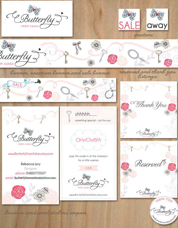
3. Logo for Butterfly from Ashes. Again the butterfly is hand drawn and I just love the color scheme of blue, black and red-pink. The whole Etsy branding set turned out beautiful.
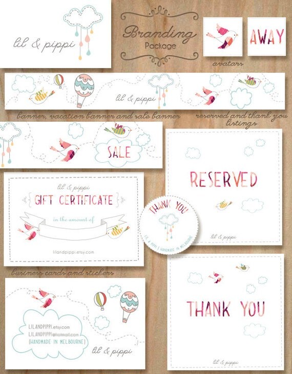
4. Logo design for lil & pippi. The client makes awesome fabric cloud mobiles. This was also part of a branding set.
5. A banner design for UK customer Kari Bellamy. I like how we mixed urban with romantic elements.
- 13/09/11
- Comments: 0
- Tags: banner design, logo design, website design
- 09/07/11
- Comments: 0
Website for Kasey Brennan

I am excited to post about my latest website project. Kasey Brennan is a voice over artist, actress, singer and a model. This can sound intimidating at first, but it turned out Kasey is the sweetest and down to earth person. She likes green, blue, purple, mustard colors and muted tones. Other favorite things are dogs, jazz and owls.
We were going for a fun but professional look of the website. I think this understanding, that business websites must differentiate from personal websites by being formal and generic as opposed to expressive and human, is a wrong notion how the web functions today. With so many websites and information online, it is important to stand out. Bringing personality in business is vital in real life and so it should be online. For this purpose I think including owls in the website design and other elements that the client likes is appropriate when done tastefully.
Kasey wanted to have an illustrated background. Using light grey drawings for the background was a way to bring interest but not steal attention away from what is most important – the website content.
I am really grateful that Kasey was open to my ideas and made the web design experience both smooth and fun!
Visit: http://www.kaseybrennan.com/
I gave Sabina creative liberty with this project and she exceeded my expectations. The time, effort, design, talent and thoughtfulness that went into creating my website really shines through. She made the site very personal and got to know me as an individual. Her advice and recommendations were all super helpful. I look forward to working with Sabina on future projects.
Kasey Brennan | Voice-over artist, actor, singer
- 09/07/11
- Comments: 0
- Tags: kasey brennan, web design, website
- 11/06/11
- Comments: 0
Latest Projects
Some bits and pieces from my latest projects.
1.
2

3

4
2. A logo design for Paper, Lace & Confetti. This name stands for a wide range of products – jewelry, paper goods, invitations, DIY Party decorating packages, Edible sweets and more! It was a challenge to create one logo to unite all this astonishing diversity.
3. New website project which I am still crafting at the moment. My client is a young, interesting woman and I am inspired to create something for her. I will post soon more details about this project.
4. A banner design for Darling Belle Events. Amanda was looking for something fun, whimsy, romantic and flowy. When she mentioned a tandem bike, I envision one where ranunculus flowers are flowing out of the basket. And all other elements came to place after that, as usually happens with my banners.
- 11/06/11
- Comments: 0
Fonts Love, June 2011
A list of fonts which I already have and love or I wish to have.
 Fidelia Script is my favorite font of the month. It is a disconnected script typeface, incredibly versatile. I used it for a logo project where I played with the space of letters and added some swashes and the look changed dramatically. I love the ornaments and the extra swashes. It can look elegant and modern, retro and romantic. Good for: wedding invitations, feminine designs, postcard designs
 Kewl Script is a very artistic font. It adds fun to projects, having this brush-script, hand-lettered look. Good for: fun invitations, packaging, greeting cards.
 Liebe Erika is on my wish list for some time now. Thin and hand-made look, which will be perfect for some of my web design and print projects. Coupled with Liebe Ornaments it can go far in print designs from tags to whimsical wedding invitations. Good for: fun blog design projects, handmade paper projects
 Refresh is an inexpensive yet fun and useful handwritten font. I just found this little gem while searching for yet another “whimsical font”. When clients say “can you give it a bit more whimsical look” (I am still not sure exactly what this means), this is the font to save the day! And it did for one or two projects this month. Good for: whimsical logo design, web design, fun projects.


- 11/04/11
- Comments: 1
Website for Stephanie Ng

I just finished working on the new website of Stephanie Ng, a freelance piano teacher. We decided the best option for her was to use WordPress and to build light, pretty and informative website.
Stephanie likes pink, aqua and turquoise colors. She wanted to have a catchy banner with birds, bird cages, flowers and hand drawn piano.
My first proposal was very clean and exclusively drawn by hand on paper, then colored digitally. We decided later to make the design more complex and to add digital drawings and elements as well.
It was a pleasure working with Stephanie. She found her way in WordPress pretty quickly and we were ready with the website in a record time.

first proposal

final design
- 06/04/11
- Comments: 0
Website redesign – Marianne Taylor

I’ve had the great pleasure of redesigning the website of Marianne Taylor – extremely talented, UK-based wedding photographer. It was a challenge to create a design which will not interfere with her amazing photos. Marianne likes: aqua, turquoise, white, pink, shades of grey colors. The style she prefers is clean, modern but romantic, sleek but a bit girly and nostalgic.
The priority was to achieve a hand-drawn, DIY look. Marianne created her logo, and I tweaked it to fit the new theme.
“I am so happy with the designs that Sabina did for my website. I wanted something feminine and whimsical, and it is exactly what she delivered. I have gotten so much positive feedback already and the site has only been live for one day” – Marianne
- 06/04/11
- Comments: 0
- Tags: redesign, romantic, web design
- 27/03/11
- Comments: 4
Book Reviews

Logo, Font & Lettering Bible. A comprehensive guide to logo and font design. Initially I was put off by the attitude of the author who explains in the introduction that lettering and logo design is not for common people. Reading further on, I warmed up to his style and by the end of the book I thought he actually has a nice sense of humor. I liked the chapter about the history of type and lettering and marveled at the devices used in the BC era (before computer). There are some very useful illustrator tips and techniques for drawing Bézier curves, which I was not entirely aware of. The chapters about drawing letters made me conscious about the fonts which I use and increased my desire to try lettering myself. Overall this is a very good book for both beginners and experienced designers.
Logo Design Love: A Guide to Creating Iconic Brand Identities. This is a very nice small book about logo design. It was easy to read (took me actually 4hrs to read it cover to cover). I don’t know if it can teach you how to design iconic brand identities but it surely gives nice tips. Visit the website of the author to learn about his logo design process and find good examples of brand identities.
Color Design Workbook: A Real World Guide to Using Color in Graphic Design. I have to admit sometimes I have problems using colors. I have never properly understood the color theory and I often use colors in a way that I personally find pleasing. Even though this is a valid approach it definitely lacks depth. Understanding the meaning of colors can elevate any design. After all, design is about influencing people and making impression. This book for the most part gave clarity to the process of combining colors. I was unaware that to achieve a balanced design an image has to combine colors which add up to gray in our brain. If you don’t know what this means, read this book.
- 19/03/11
- Comments: 0
Freebies – Spring Tulip Patterns

Saturday is a good day for freebies. I usually work on projects during the week and on the weekend take time with the family and for my sketch book. I made some drawings of tulips and manipulated these digitally to create patterns. This package includes 3 tulip patterns: one decorated with white flowers, one more clean and one more fresh. You can use these for your blog and twitter background, scrapbooking or other purpose you see fit. Only for personal use (and if you credit me that would be lovely)!
Download the Spring Tulip Patterns Pack:
[download id="1"]
- 19/03/11
- Comments: 0
- Tags: background, free patterns, freebies, pattern, pink, tulip, tulips

